
Ionic comes with default transitions for pages and modals. In this article we will see how to use Animation, PageTransition from ionic-angular to add custom animated transitions in ionic modal.
In order to add custom animated transitions for Ionic Modal We will be using Ionic Modal Options enterAnimation and leaveAnimationfrom ModalOptions interface. For a modal there are transition states: On Enter of modal and and On Leave of modal when we close it. If you look at the Ionic Modal options interface you will find 2 options to add animations for both the states.
export interface ModalOptions {
    showBackdrop?: boolean;
    enableBackdropDismiss?: boolean;
    enterAnimation?: string;
    leaveAnimation?: string;
    cssClass?: string;
}
We will use these options in modal to specify transition class we create using Animation class from ionic-angular. So lets see how we can create and custom animated transitions step by step.
Step 1: Create Transition Classes:
on-enter-translate.transition.ts
import { Animation, PageTransition } from 'ionic-angular';

export class ModalTranslateEnterTransition extends PageTransition {

    public init() {
        const ele = this.enteringView.pageRef().nativeElement;
        const wrapper = new Animation(this.plt, ele.querySelector('.modal-wrapper'));

        wrapper.beforeStyles({ 'transform': 'translateX(100%);', 'opacity': 1 });
        wrapper.fromTo('transform', 'translateX(100%)', 'translateX(0)');
        wrapper.fromTo('opacity', 1, 1);

        this
            .element(this.enteringView.pageRef())
            .duration(500)
            .easing('cubic-bezier(.1, .7, .1, 1)')
            .add(wrapper);
    }
}
on-leave-translate.transition.ts
import { Animation, PageTransition } from 'ionic-angular';

export class ModalTranslateLeaveTransition extends PageTransition {

    public init() {
        const ele = this.leavingView.pageRef().nativeElement;
        const wrapper = new Animation(this.plt, ele.querySelector('.modal-wrapper'));
        const contentWrapper = new Animation(this.plt, ele.querySelector('.wrapper'));

        wrapper.beforeStyles({ 'transform': 'translateX(100%)', 'opacity': 1 });
        wrapper.fromTo('transform', 'translateX(0)', 'translateX(100%)');
        wrapper.fromTo('opacity', 1, 1);
        contentWrapper.fromTo('opacity', 1, 0);

        this
            .element(this.leavingView.pageRef())
            .duration(500)
            .easing('cubic-bezier(.1, .7, .1, 1)')
            .add(contentWrapper)
            .add(wrapper);
    }
}
What we are doing here is we creating Transition Classes to apply in Angular Configuration so we can use them in Ionic Modal Options.
In above example we are using default init() method from PageTransition class to initiate the transition, which invoked when transition is initiated.
We are using nativeElement from ViewController for direct access to DOM. In the next line are selecting a .modal-wrapperusing querySelector().
Next we are creating a new Animation instance using current platform and our selected element. Then we are setting inline styles and transition properties from and to this animation element before the animation begins. And finally we are adding our wrapper as a add a child animation to this animation via add() method.
Step 2: Import Classes And Set Transition in Angular Config
We will be using setTransition()Method from Angular Core Config Class.
setTransition(trnsName: string, trnsClass: any): void;
This method accepts 2 arguments Transition Name and Transition Class. W can use this method to set our transitions.
export class AppModule {
    constructor(public config: Config) {
        this.setCustomTransitions();
    }

    private setCustomTransitions() {
        this.config.setTransition('modal-translate-up-enter', ModalTranslateEnterTransition);
        this.config.setTransition('modal-translate-up-leave', ModalTranslateLeaveTransition);
    }
}
Final Step: Use These Transitions Modal Options
Once we have set transitions inside configuration we can use these transitions Modal Options to apply animation when we create a modal.
var modal = this.modalCtrl.create(AddToCartModalPage, {
    productId: this.productId,
    skuId: this.skuId,
    zipcode: this.zipcode,
    sellerProfileId: this.sellerProfileId,
    branchId: this.branchId,
    changeSeller: this.changeSeller
}, {
    showBackdrop: false,
    enableBackdropDismiss: false,
    cssClass: 'add-to-cart-modal',
    enterAnimation: 'modal-translate-up-enter',
    leaveAnimation: 'modal-translate-up-leave'
});
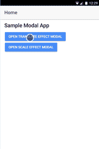
That’s all! You can find complete code example with Scaling animation as well here on our Github Repository.
Please feel free to ask any questions. Share as much as you can if you liked this article.
Cheers!